There are four different Rendering Intents with which you may want to familiarize yourself with: Relative Colorimetric, Perceptual, Absolute Colorimetric, and Saturation. In this article we will attempt to demystify the dark art of knowing which one to choose for different situations.
Beginner
Anything onto a glossy/satin/luster paper: Relative Colorimetric with Blackpoint Compensation on
Photography onto matte paper: Perceptual with Blackpoint Compensation on
Digital Artwork onto matte paper: Relative Colorimetric with Blackpoint Compensation on
Traditional Artwork onto matte paper: Relative Colorimetric with Blackpoint Compensation off
Unsure?: Relative Colorimetric with Blackpoint Compensation on
Keep reading to learn more about these recommendations and all the factors that go into choosing the right rendering intent for your needs.
Intermediate
What is Rendering Intent?
Rendering intent describes the four modes by which color management systems adapt some or all colors in a picture to the limitations of a given display or printer.
"For most images, Relative Colorimetric rendering produces superior results. For others, Perceptual will be far better. These cases include images with significant shadow details where a slight lightening of the print is acceptable to open up the shadows. Also images with areas of highly saturated color can benefit from Perceptual rendering. If you see color banding in the soft proof with Rel. Color. selected, try Perceptual. With experience you will get a feel for which images best pair with each rendering intent."
Relative Colorimetric vs Perceptual Intent: What's the Difference?
The difference between Relative Colorimetric and Perceptual lies in how they handle colors when converting between different color spaces, especially concerning out-of-gamut colors (colors that fall outside the range of the target device).
In essence, while Relative Colorimetric prioritizes accuracy for in-gamut colors, Perceptual prioritizes preserving the visual relationship between all colors.
Intent Definitions - Per the Photoshop Print Dialog
Perceptual - Aims to preserve the visual relationship between color so it's perceived as natural to the human eye, even though the color values themselves may change. This intent is suitable for photographic images with out-of-gamut colors.
Relative Colorimetric - Compares the white of the source color space to that of the destination color space and shifts all color accordingly. Out-of-gamut colors are shifted to the closest reproducible color in the destination color space. Relative colorimetric preserves more of the original colors in an image than Perceptual.
Advanced
Information Accuracy
Lets start off with a bit of disclaimer. Almost everything below will have some people that disagree and will have some exceptions or edge cases. Some things are a bit of a gloss in order to not turn this into a complete course on human vision and color science. Ultimately its up to each person to try their prints with different settings to determine what works best with their particular combination of image, printer, paper, and software and the desired finished look they are going for. There isn't one "best setting" otherwise there wouldn't be so many options. Also note there are other rendering intents than the four discussed below, but they are very rare and for special use cases.
With this in mind, here is some information that will hopefully be useful in understanding how color printing works.
Glossy vs Matte Paper
Papers with some amount of sheen - be it glossy, semi-gloss, satin, luster, etc. - will have deeper blacks, a larger color range, and overall richer colors compared to matte papers. To read this diagram, white is in the middle-ish and colors get more saturated as you move toward the edges. Here, you can see the color range possible on Aurora Art Natural (a matte cotton art paper) when using the popular Epson ET-8550 printer. This is represented by the red line. Compare this to Arctic Polar Luster (which has a satin-luster sheen finish) - represented by the green line. | 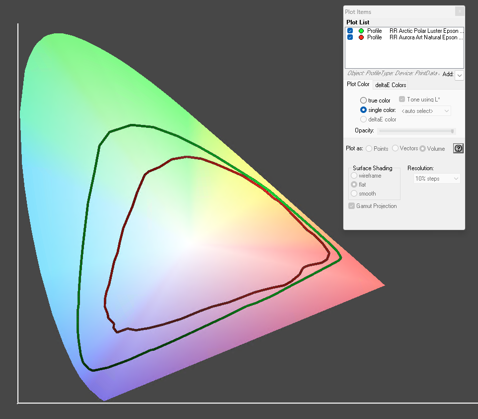 |
The above diagram shows color range in 2 dimensions, but we can add a third dimension (with white at the top and black at the bottom) to get a better understanding of the color range printable on a given paper. Matte cotton art papers like Aurora Art Natural will always have a smaller color range (also called a color gamut) compared to a paper like Arctic Polar Luster. This can also be seen in the dark areas - looking at the comparison in three dimensions you can see how the Arctic Polar Luster has a lot larger range in dark areas. | 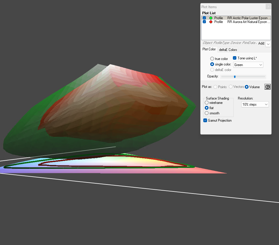 |
Optical Brightening Agents
Optical Brightening Agents (also called Fluorescent Whitening Agents; abbreviated OBAs or FWAs) are chemicals added to paper in order to make it fluoresce blue in the presence of UV light. The result is a paper that appears super-bright-white when viewed under natural daylight or indoor fluorescent lights.
A paper that is free of OBAs, such as our Palo Duro Softgloss Rag or Aurora Art Natural, will be the same color regardless of UV light presence.
A paper that has OBAs, such as our Polar Matte or Aurora Art White, will appear more blue in the presence of UV light. In fact, papers with OBAs are actually emitting blue light.
Here you can see Aurora Art Natural next to Aurora Art White indoors under LED lighting (they will look very similar as typical LED lighting does not emit UV light)
<insert graphic>
And here is them next to each other outside
<insert graphic>
You can do this test yourself by ordering samples of Aurora Art Natural and Aurora Art White from this page: <link>
With prolonged exposure to UV light, papers with OBAs will eventually (ie after years or decades) turn back to their natural color, which can seem like 'yellowing'. This is why we designate papers that are both Acid Free and OBA Free as "Museum Grade". OBA Free papers are already their natural color, so wont experience this color shift over time.
A common mistake people make related to OBAs, is to frame an OBA-free paper with a white mat that OBAs. This can cause the paper to look yellower than it is when the mat is exposed to UV light. Likewise, using white mate without OBAs with a paper that contains OBAs can cause the mat to look yellower than it is. Be sure to look at your print and mat together under both indoor and natural light.
What is 'White'?
In Inkjet printing you may notice there is no white ink in your printer. There are two different ways to produce white:
Most commonly, the paper itself is used as 'white'. As you get closer to 'white' in the image, the color of the paper plays more and more a role in the actual perceived color of the print. This is similar to the way many watercolor artists will use the paper itself as 'white' even when painting on natural-warm papers. A side effect of this, for example, is when printing on a warm-toned paper like Aurora Art Natural, your whites will be warmer-white than they appear on your computer screen (unless you turn on Soft Proofing with Simulate Paper Color enabled in your image editing application).
Another option is to actively try to correct for paper color using tricks of the way human vision works to get a 'white' that appears closer to true-neutral-white than the paper itself. For example, by printing a very light cyan color inversely proportional to the ink density when using Aurora Art Natural will 'cancel out' the slight yellow of the paper and make the white seem to whiter than the off-white paper color.
Viewing / Measuring Conditions
Keeping in mind the information in the Optical Brighteners section above, we can see that the lighting conditions under which you view your prints can make a big difference in the colors you are actually seeing. You may be aware that light color has a "temperature" measured in Degrees Kelvin. It may seem a bit backward but a lower temperature indicates an oranger color light, and a higher temperature indicates a bluer color light. If you shop for lightbulbs, you will commonly see on the side of the box they state their light color using this system.
With this in mind, there are two different standard viewing/measuring conditions to be aware of:
D50 (aka M1) - This is the most common standard viewing condition and has a color temperature of 5000K and a moderate amount of UV light. This viewing condition is similar to natural early-morning daylight. A downside of this condition is indoor LED lights don't typically emit any UV light and actual early-morning daylight can vary quite a bit so it can be difficult to accurately recreate this lighting condition. An upside is that 5000K is right in the middle of the 1,000K-10,000K range that we can normally perceive as being 'white' - so its a very neutral condition without perceived color cast.
D50M2 (aka M2, aka UV-Cut or UV Filtered) - This is similar to most "neutral white" indoor LED lights. Like D50, it uses 5000K temperature light - but UV light is either filtered our or simply not emitted from the light source.
There are others as well, such as D65 (which is similar to D50 but uses bluer 6500K color lighting, which is closer to afternoon natural light) or Illuminant A (orange tungsten incandescent lighting) but the above two are the most important to understand.
You will get the most accurate colors when viewing a print under the same viewing condition as its ICC color profile was created. Unless otherwise stated, all of our recent ICC color profiles will be the most accurate when viewed under D50 lighting conditions. Here's why:
- For viewing OBA-free papers the difference between D50 and D50M2 is non-existent or negligible.
- For viewing papers with OBAs, D50 is a compromise middle-ground that works well under a wide variety of lighting conditions (while not being perfect under any one real-world condition).
- Unless you in a completely sealed-off room, most indoor settings will have some amount of UV-containing daylight present during the day, even if using LED lights as the primary lighting.
- D50 (M1) is the current recommendation from the Fogra research institute for general-purpose ICC profiles.
What is Rendering Intent?
What happens when you try to print a color that is outside the range of the paper?
How do you tell the printer that you want to work with the paper color or work against it?
How do you compensate for OBA's?
Rendering Intent is how we do these things.
Relative Colorimetric
This is the most commonly used Rendering Intent, and a great place to start, generally.
This one will work WITH the paper color, using the paper color as white. Relative Colorimetric will keep the majority of colors very close to the intended color but makes slight adjustments so that colors are relative to the white color and brightness of the paper. This will give you warm-looking prints when printing on warm-toned paper and bright-white prints when printing on bright-white paper.
On matte papers especially, using this setting may result in blockyness in dark areas or saturated areas. If you run into "crushed blacks" you can try turning on Blackpoint Compensation (see below) and/or switching to Perceptual Rendering Intent. If you run into blockyness in saturated colors, switch to Perceptual.
Of the two most commonly used rendering intents, Relative Colorimetric is the most color-accurate and is popular for printing artworks as well as when printing photos on media with a very large color range. The color-shifts when using Relative Colorimetric are typically very small and are very predictable.
Perceptual
This is the second most commonly used Rendering Intent, and is very popular with photographers that have very saturated colors in their images or black and white photos with lots of shadow-area detail.
Like Relative Colorimetric, Perceptual works WITH the paper color and treats the paper as being 'white'.
Where they differ, is that Perceptual will look at the most saturated colors in the image and the darkest colors in the image and will scale all of the colors in toward neutral, in order to maintain relationships between colors (and preserve details in extreme saturations or dark areas) at the expense of absolute color-accuracy.
If you notice blockyness in shadows or saturated areas when using another rendering intent, then this is a good rendering intent to try next.
Since this rendering intent does different amounts of adjustment depending on the exact colors in an image, its a bit less predictable from one image to another than Relative Colorimetric.
Absolute Colorimetric
This is the most overall color-accurate Rendering Intent. Rather than working with the color of the paper, it will actively work to correct for it.
This is useful in a couple of scenarios:
- You want to print true neutral grays and whites onto a warm-toned paper (by automatically printing light cyan inversely proportional to the ink density)
- Hard Proofing for things that will be sent to a lab or CMYK printing shop, or when you don't know the details of the paper that will be used for final production
- Things that will be displayed outdoors and printed onto OBA-containing papers (by automatically printing light yellow inversely proportional to the ink density)
- Color-accurate viewing in a professional viewing booth
- Lab testing of ICC color profile accuracy under ideal, fixed conditions
Not all printing applications support Absolute Colorimetric rendering (Photoshop does). If using printing software that does not (such as Canon Professional Print and Layout), we have alternative ICC profiles that simulate Absolute Colorimetric rendering. Email our support for more details.
If you are a designer or artist using OBA-containing media and need D50M2 (UV-Cut) ICC profiles for use with Absolute Colorimetric color-matching under standard LED lights, we can provide these ICC profiles for you. Please email our support for more details.
Saturation
This is mostly common used when printing business documents, charts, flyers, and other things where vivid colors are more important than color accuracy. This is less commonly used in photo and art printing than the other rendering intents.
Not all printing applications support Saturation rendering (Photoshop does)
Blackpoint Compensation
Blackpoint Compensation (BPC) is a setting used in conjunction with a Rendering Intent. It will analyze the image and find the darkest black and compare that to the darkest black that is printable on the media. It will then raise up all the dark areas, if needed, so that there is no (or at least less) 'clipping' / blockyness / 'crushing' in the dark areas of an image.
Its very common to have this turned on when printing photographs, especially black and white photography where there may be lots of detail in the shadow areas.
You will see the biggest difference when printing on matte paper.
Since the amount of adjustment this does is based on the colors in the image, the amount of adjustment can be a bit unpredictable from one image to another. Sometimes Blackpoint Compensation can cause an image to look washed out when printed.
Blackpoint Compensation can be used with any of the above Rendering Intents (though many programs will disable it for Absolute Colorimetric).
Related Posts and Information
Last updated: May 19, 2026


