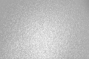
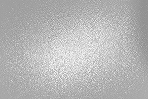
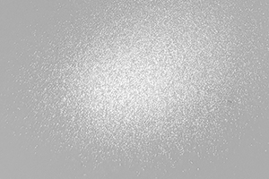
Surface Texture Comparison
Each of our satin and luster photo papers features a unique texture that subtly enhances your prints. The photos below showcase these differences, with each image converted to black and white to better highlight the surface textures. The depth and prominence of the texture influence how the paper feels and how the image is viewed up close. The more pronounced the texture, the more visible it is when examining a print at close range, while from a distance, it becomes virtually unnoticeable.
In general, a more textured surface helps reduce reflection and glare, offering a smoother viewing experience under various lighting conditions. For example, papers like our Palo Duro Satin, with its finer texture, maintain a lower gloss level compared to traditional gloss papers, ensuring your prints have a more refined, professional finish.
| UltraPro Satin 4.0® | UltraPro Luster 300® |
|---|---|
 |
 |
| Arctic Polar Luster® | Palo Duro Satin® |
 |
 |
Paper Details Comparison
| Paper Name | UltraPro Satin® | UltraPro Luster® | Palo Duro Satin® | Arctic Polar Luster® |
|---|---|---|---|---|
| Quality | As good as major retail brands | As good as major retail brands | Better than retail brands | Exceeds lab quality |
| Weight | 270 gsm (68lb) | 300 gsm (80lb) | 255 gsm (66lb) | 300 gsm (75lb) |
| Thickness | 10.4 mil | 11.8 mil | 10.4 mil | 11.8 mil |
| Paper Shade | Bright white (cool tone) | Bright white (cool tone) | Bright white (warm tone) | Bright white (cool tone) |
| Printer Compatibility | Universal | Universal | Universal | Universal |
| Print on Back | No | No | No | No |
| Markings on Back | No | No | No | No |
| Water Resistant? | Yes | Yes | Yes | Yes |
| Rolls | Yes | Yes | Yes | Yes |
details/order |
details/order |
details/order |
details/order |
Related Posts and Information
Last updated: October 01, 2024


