Satin Paper vs Matte: Differences & When To Choose Each One
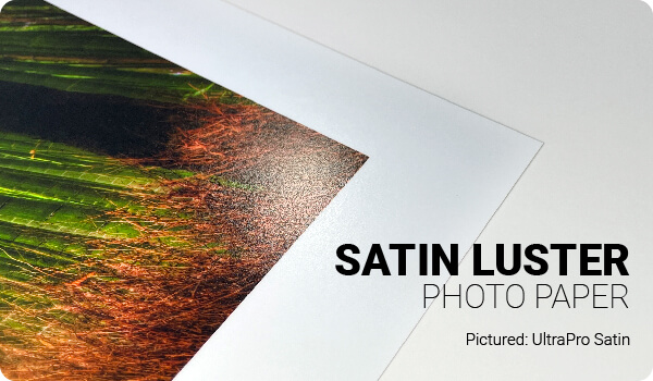
In the ever-expanding and evolving realm of photo paper used in photography, various mediums are available for showcasing captured moments, with satin and matte finishes being two popular choices for photo prints.
Satin and matte finishes each possess distinctive characteristics and benefits, presenting both emerging and experienced photographers with a sometimes-challenging decision. This article explores the differences between satin photo paper and matte photo paper, providing insights to guide your selection.
What is Satin Photo Paper?
Satin paper exhibits a medium sheen, positioning itself between glossy and matte finishes. This paper is known for its soft, lustrous quality, and lightly textured surface.
What is Matte Photo Paper?
Matte photo papers, in contrast, present a non-glossy, flat appearance. Its non-reflective finish makes it suitable for photos intended for viewing under bright light and for images where you want the viewer to see maximum detail. You can browse our matte photo paper collection.
Comparison Table
| Feature | Satin Photo Paper | Matte Photo Paper |
|---|---|---|
| Finish | Soft sheen between glossy and matte | Flat, non-glossy finish |
| Surface Texture | Lightly textured, often called an E-Surface | Smooth, non-reflective surface |
| Light Reflection | Low to moderate reflection | Very low reflection |
| Glare | Some glare under direct light | Minimal glare, even in bright spaces |
| Color Vibrancy | Rich, vibrant colors | Softer, more natural-looking colors |
| Black Depth | Deeper blacks | Softer blacks |
| Contrast | Higher perceived contrast | More subdued contrast |
| Photo Detail | Excellent detail with added depth | Excellent visible detail without distracting reflections |
| Best for Portraits | Excellent | Good |
| Best for Landscapes | Excellent | Good, especially for softer scenes |
| Best for Black & White | Good for higher-contrast images | Excellent for subtle tonal work |
| Best for Art Prints | Good for photographic artwork | Excellent for a traditional art-print appearance |
| Brightly Lit Displays | Good, but some reflections are possible | Excellent because of the non-reflective surface |
| Handling / Fingerprints | Textured satin surfaces help minimize visible fingerprints | Generally easy to handle without obvious fingerprints |
| Overall Look | Traditional professional photo-lab appearance | Soft, understated, artistic appearance |
| Choose It When… | You want vibrant color, deeper blacks, and some sheen without the reflectivity of glossy paper | You want minimal glare, subtle tones, and a completely non-glossy presentation |
Which is better, satin or matte photo paper?
Neither finish is universally better. Choose satin photo paper when you want richer colors, deeper blacks, stronger contrast, and a traditional photo-lab look with less glare than glossy paper. Choose matte photo paper when you want virtually no glare, softer tones, and a non-reflective finish for art prints, black-and-white photography, or photos displayed in bright environments.
Differences Between Satin and Matte Photo Papers
The difference between satin and matte photo papers can be categorized into three areas: texture and feel, reflection and glare, and color vibrancy and depth.
Texture and Feel of Satin vs Matte
With a subtle sheen, satin has a light texture, known in the photography industry as the "E-Surface". That said, the surface is fairly smooth to the touch.
The matte finish, alternatively, is very smooth in terms of appearance and touch. It is totally non-reflective.
Reflection and Glare of Satin vs Matte
Satin papers have a semi-gloss finish that reflects some light, albeit less than its glossy counterparts.
With its non-reflective nature, matte effectively reduces glare, making it ideal for brightly lit environments.
Color Vibrancy and Depth of Satin vs Matte
Satin amplifies color vibrancy, lending images a lively quality with deeper blacks and heightened contrast compared to matte.
Offering softer, muted colors, matte provides a natural appearance ideal for black-and-white photos or those with subtle tones.
When to Choose Satin Paper or Matte Paper?
Satin Photo Paper Is Ideal For:
Portraits: Satin's subtle shine enhances details and depth in skin tones.
Landscapes: The finish's color vibrancy makes nature photographs stand out.
Mixed Lighting Photos: Satin adeptly manages contrasts between dark and light elements.
Matte Photo Paper Is Ideal For:
Artistic Prints: The muted finish of matte complements artistic photographs.
Bright Space Displays: With no light reflection, matte is perfect for images displayed in well-lit areas.
Scrapbooking: The tactile texture of matte adds a sensory layer to scrapbook pages.
Conclusion
Both satin and matte photo paper have their unique qualities and potential applications. Your choice between them should be influenced by the intent of the photo, the viewing environment, and personal aesthetic preferences. Always remember, the best paper finish is the one that elevates your photography and resonates with your vision.
Original Publication Date: June 01, 2023
Article Last updated: August 14, 2026
Related Posts and Information
Categories
About Photographers
Announcements
Back to Basics
Books and Videos
Cards and Calendars
Commentary
Contests
Displaying Images
Editing for Print
Events
Favorite Photo Locations
Featured Software
Free Stuff
Handy Hardware
How-To-Do-It
Imaging
Inks and Papers
Marketing Images
Monitors
Odds and Ends
Photo Gear and Services
Photo History
Photography
Printer Reviews
Printing
Printing Project Ideas
Red River Paper
Red River Paper Pro
RRP Products
Scanners and Scanning
Success on Paper
Techniques
Techniques
Tips and Tricks
Webinars
Words from the Web
Workshops and Exhibits
all
Archives
August, 2026
July, 2026
June, 2026
May, 2026
April, 2026
March, 2026
February, 2026
January, 2026
November, 2025
more archive dates
archive article list


Red River Paper Inc. All contents © 1997 - 2026. 8900 Ambassador Row, Dallas Texas, 75247. Prices, specifications, and images are subject to change without notice. Not responsible for typographical or illustrative errors. Website Terms & Conditions | Acceptable Use
Site Development & Maintenance: Phosphor Media, LLC