Understanding Aspect Ratios
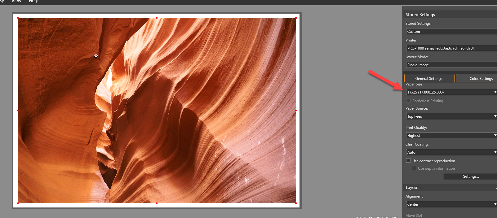
Whether you're preparing images for photo printing, uploading photos to your website, creating product listings, or designing page banners, understanding aspect ratios helps you avoid unexpected cropping, stretched images, and poor composition.
An aspect ratio simply describes the relationship between an image's width and height. It doesn't tell you how large an image is—it tells you its shape.
Once you understand aspect ratios, you'll find it much easier to prepare photos for printing, optimize images for your website, and maintain a professional, consistent look across your content.
Quick Answer: What Is an Aspect Ratio?
An aspect ratio is the proportional relationship between an image's width and height.
For example:
- 3:2 means the image is 3 units wide for every 2 units tall.
- 4:3 means the width is slightly narrower relative to the height.
- 1:1 is a perfect square.
- 16:9 is the standard widescreen format used for most videos and modern displays.
The actual pixel dimensions don't matter as long as the proportion stays the same.
These images all share a 3:2 aspect ratio:
- 600 × 400 pixels
- 3000 × 2000 pixels
- 6000 × 4000 pixels
Even though they're different sizes, they're the exact same shape.
Why Aspect Ratios Matter
Aspect ratios affect nearly every stage of working with digital images.
Understanding them helps you:
- Print photos without unwanted cropping
- Design web pages with consistent image layouts
- Upload product photos that display correctly
- Create banners that fit website templates
- Resize images without distortion
- Prepare videos for different platforms
For photographers, aspect ratios become especially important when moving from digital capture to physical prints.
For example, many DSLR and mirrorless cameras shoot in 3:2, while many popular print sizes use 4:5, 5:7, or 8:10 proportions. That means some cropping is usually required before printing.
Tips for Resizing Images on Your Site
Before resizing any image, ask yourself one question:
Does the destination require a specific aspect ratio?
If the answer is yes, crop first and resize second.
Following this order preserves image quality and prevents distortion.
Here are a few best practices:
- Never stretch an image to force it into a different shape.
- Crop strategically rather than squeezing the image.
- Keep important subjects away from the edges.
- Upload the largest practical image for your website.
- Use consistent aspect ratios across galleries and product pages.
- Save high-resolution originals before making crops.
If you're preparing images for both web and print, always keep the uncropped original so you can create multiple versions later.
Sections
Many websites require different aspect ratios for different sections.
For example:
| Website Section | Common Aspect Ratio |
|---|---|
| Blog featured image | 16:9 |
| Product image | 1:1 |
| Hero banner | 21:9 or wider |
| Team photos | 4:5 |
| Gallery images | 3:2 or 4:3 |
| Social media thumbnails | 1:1 |
Using consistent ratios creates a cleaner, more professional appearance and reduces unexpected cropping across devices.
Watch a Video
Sometimes it's easier to understand aspect ratios visually than through numbers alone.
Watching a short tutorial on cropping, resizing, and preparing images can help you quickly see:
- how different aspect ratios compare
- why images get cropped
- how to preserve important details
- how to prepare photos for print
If you're following one of Red River Paper's printing tutorials, you'll typically see the required aspect ratio demonstrated before printing begins.
Cropping to an Aspect Ratio
Cropping changes the shape of an image without changing its resolution.
Instead of stretching an image, cropping removes unwanted areas to create the desired proportion.
Most photo editing software—including Photoshop, Lightroom, Photoshop Elements, Capture One, Affinity Photo, and many free editors—allows you to crop by aspect ratio.
Option 1 – Crop to a Pre-Set Shape
Most editing programs include preset aspect ratios.
Examples include:
- Original
- Square (1:1)
- 3:2
- 4:3
- 5:4
- 16:9
- 8×10
- 5×7
Simply choose the preset and reposition the crop box until your composition looks right.
This is usually the fastest method.
Best for:
- Standard print sizes
- Social media
- Website images
- Product photography
Option 2 – Custom Dimensions
Sometimes you need a ratio that's not listed.
Most editors allow you to enter custom values.
For example:
- 21:9
- 7:5
- 2.39:1
- 9:16
The actual numbers aren't important.
These all represent the same ratio:
- 1600 × 900
- 1920 × 1080
- 3840 × 2160
Because they're all 16:9.
Custom ratios are useful for:
- website headers
- panoramic prints
- custom page banners
- marketing graphics
Page Banners
Website banners are typically much wider than standard photographs.
Common banner aspect ratios include:
| Banner Type | Typical Ratio |
|---|---|
| Hero image | 21:9 |
| Full-width banner | 16:5 |
| Homepage slider | 16:9 |
| Landing page banner | 3:1 |
When creating banners:
- choose wide landscape photos
- leave negative space for text
- avoid placing important subjects at the edges
- preview banners on mobile devices
Because banners often crop differently on desktop and mobile, it's smart to keep the focal point near the center.
Aspect Ratios for Product Images
Most ecommerce platforms perform best when every product image has the same aspect ratio.
This creates a cleaner shopping experience and prevents inconsistent layouts.
Common product image ratios include:
| Platform | Typical Ratio |
|---|---|
| Square product galleries | 1:1 |
| Lifestyle products | 4:5 |
| Marketplace listings | 1:1 |
| Amazon | 1:1 |
| Shopify | 1:1 or 4:5 |
If you're photographing paper samples, prints, greeting cards, or framed artwork, maintaining a consistent ratio helps every product appear aligned throughout your catalog.
Aspect Ratios for Videos
Video uses different aspect ratios than still photography.
Today's most common formats include:
| Format | Aspect Ratio |
|---|---|
| YouTube | 16:9 |
| Television | 16:9 |
| Instagram Reels | 9:16 |
| TikTok | 9:16 |
| Facebook Stories | 9:16 |
| Cinema | 2.39:1 |
When creating promotional videos or tutorials, exporting in the correct ratio prevents black bars or awkward cropping.
Aspect Ratios as Percentages
Some web design tools describe aspect ratios as percentages instead of fractions.
The percentage is calculated by dividing the height by the width.
Examples:
| Aspect Ratio | Percentage |
|---|---|
| 1:1 | 100% |
| 4:3 | 75% |
| 3:2 | 66.7% |
| 16:9 | 56.25% |
| 21:9 | 42.86% |
These values are commonly used in CSS when creating responsive image containers.
Examples of Aspect Ratios
Here's a quick reference for the most common aspect ratios you'll encounter.
| Aspect Ratio | Common Uses |
|---|---|
| 1:1 | Product photos, Instagram posts |
| 4:3 | Older digital cameras, presentations |
| 3:2 | DSLR and mirrorless cameras, many photo prints |
| 5:4 | 8×10 prints |
| 7:5 | 5×7 prints |
| 16:9 | Video, websites, presentations |
| 9:16 | Vertical video |
| 21:9 | Hero banners, panoramas |
| 2.39:1 | Cinematic video |
Aspect Ratios and Photo Printing
One of the most common questions photographers have is why an image doesn't perfectly fit a particular print size.
The answer almost always comes down to aspect ratio.
Here are a few common examples:
| Camera Ratio | Fits Naturally | Requires Cropping For |
|---|---|---|
| 3:2 | 4×6, 8×12, 12×18 | 5×7, 8×10, 11×14 |
| 4:3 | 6×8, 9×12 | 4×6, 8×10 |
| 1:1 | Square prints | Most rectangular prints |
| 16:9 | Panoramic prints | Traditional photo sizes |
Cropping before printing gives you complete control over the final composition instead of letting the printer crop automatically.
Frequently Asked Questions
What is the most common photo aspect ratio?
Most DSLR and mirrorless cameras capture images in 3:2, while many smartphones use 4:3 by default.
Does resizing change the aspect ratio?
No. Resizing changes the image dimensions. Cropping changes the aspect ratio.
Can I print any aspect ratio?
Yes. However, standard print sizes have fixed proportions. If your image's aspect ratio doesn't match the paper size, you'll need to crop the image or leave white borders.
Why do my website images get cropped?
Many website builders automatically crop uploaded images to fit predefined layouts. Cropping your images to the correct aspect ratio before uploading gives you control over the final appearance.
Is a higher aspect ratio better?
No. Aspect ratios simply describe shape. The best aspect ratio depends on your intended use, whether that's printing photographs, creating product images, designing page banners, or publishing videos.
Final Thoughts
Aspect ratios are one of the simplest concepts in digital imaging, yet they have a major impact on how your photos look online and in print. By understanding the relationship between width and height, you can crop with confidence, prepare images for virtually any platform, and avoid surprises when it's time to print.
Whether you're designing a website, uploading product photos, creating videos, or making gallery-quality prints on premium Red River Paper, choosing the correct aspect ratio ensures your images look exactly the way you intended.
Original Publication Date: July 20, 2026
Article Last updated: August 03, 2026
Related Posts and Information
Categories
About Photographers
Announcements
Back to Basics
Books and Videos
Cards and Calendars
Commentary
Contests
Displaying Images
Editing for Print
Events
Favorite Photo Locations
Featured Software
Free Stuff
Handy Hardware
How-To-Do-It
Imaging
Inks and Papers
Marketing Images
Monitors
Odds and Ends
Photo Gear and Services
Photo History
Photography
Printer Reviews
Printing
Printing Project Ideas
Red River Paper
Red River Paper Pro
RRP Products
Scanners and Scanning
Success on Paper
Techniques
Techniques
Tips and Tricks
Webinars
Words from the Web
Workshops and Exhibits
all
Archives
August, 2026
July, 2026
June, 2026
May, 2026
April, 2026
March, 2026
February, 2026
January, 2026
November, 2025
more archive dates
archive article list


Red River Paper Inc. All contents © 1997 - 2026. 8900 Ambassador Row, Dallas Texas, 75247. Prices, specifications, and images are subject to change without notice. Not responsible for typographical or illustrative errors. Website Terms & Conditions | Acceptable Use
Site Development & Maintenance: Phosphor Media, LLC