Reading the Surface: What Kodak’s Historic Photo Papers Teach Us About Modern Inkjet Media
A book report on Kit Funderburk’s A Guide to the Surface Characteristics: Kodak Fiber Base Black-and-White Papers
Kit Funderburk’s A Guide to the Surface Characteristics: Kodak Fiber Base Black-and-White Papers (second edition) is more than a catalog of discontinued photo papers. It shows how chemistry, papermaking, manufacturing limits, and photographers’ taste together shaped the way a printed photograph looks and feels.
If you choose between glossy, satin, luster, matte, and fine art inkjet papers today, the language in old Kodak catalogs will sound familiar. Smooth, rough, luster, semi-matte, velvet, double weight: we still use most of these words.
That familiarity can be misleading.

The result is a solid history of how photo paper was made, and a useful lesson for anyone trying to understand the papers we print on today.
Decoding Kodak’s “Alphabet Soup”
For much of Kodak’s history, a capital letter after a paper’s name identified a particular version of that product. Collectors and historians sometimes treat those letters as one consistent code. Funderburk shows why that gets people into trouble.
In the 1880s, letters might separate thickness and general texture. Eastman Permanent Bromide Paper came as A (thin and smooth), B (heavy and smooth), and C (heavy and rough). Other lines used numbers the same way.
As the product list grew, the letters got more complicated. By 1932, E could mean rough, matte, and old ivory in one line; smooth, semi-matte, and white in another; and rough, lustre, and buff in a third. A letter meant something for a given product in a given year, not across the whole catalog.
By the 1940s Kodak had settled on a more logical system. A surface designation generally described three things:
- Texture: the physical topography of the surface
- Sheen: the amount and character of reflected light
- Tint: the apparent color of the paper base
Paper weight was handled separately, usually as single, medium, or double weight.
That distinction still matters. People often use a word like luster to describe a whole paper, but texture and sheen are different properties. Two papers can have nearly the same surface texture and still reflect light differently, and that changes how sharp, dense, colorful, and contrasty a print looks.
Photo Paper Begins Below the Image
One of the book’s real strengths is that it looks at photographic paper from the inside out.
Kodak started coating photographic materials on paper in the early 1880s, but the raw base had to come from Europe. American mills couldn’t yet make paper consistently clean, pure, and stable enough. Contaminants that wouldn’t matter in ordinary paper could react with light-sensitive silver salts and leave defects in a print.
Making its own base paper became urgent when World War I disrupted European supply. Kodak’s first experimental paper machine started running in 1914. Hundreds of trials followed, and many produced paper that couldn’t be used for photography. Iron, bronze, dirt, wood fragments, and other contaminants showed up as black or white spots once the paper was coated and processed.
It’s a good reminder that a sheet of photo paper is an engineered product. How it performs depends on the coating you can see, but also on fiber selection, pulp treatment, additives, how the web forms on the machine, pressing, drying, sizing, and calendering.
Even “paper weight” is less exact than it sounds. Kodak’s single, medium, and double weight categories mostly described ranges of raw base weight, not the finished sheet after baryta, gelatin, and emulsion were added. Thickness wasn’t tied to weight either. A manufacturing change could shift one without an equal change in the other.
Inkjet users run into the same thing today with grammage and caliper. Grams per square meter is mass per unit area; mils is thickness. Neither number alone tells you how stiff or substantial a paper will feel, or how easily it will feed.
Why Baryta Matters
The book’s account of baryta coating is especially worth reading for anyone who cares about fine photo papers.
Baryta is mostly barium sulfate pigment, applied with gelatin and other ingredients over the raw paper base. In traditional silver-gelatin papers, it gave the emulsion a cleaner, more uniform surface to sit on. It kept the image layer away from the fibers, hid flaws in the base, added whiteness and surface character, and is a big part of why classic fiber prints look the way they do.
At Kodak, baryta coating was an industrial art. A paper might get one coat or several, depending on its surface and use. Early smooth, glossy, double weight papers could get as many as six, with drying between each pass. Rougher papers usually got less, because a heavy coat would fill in the texture underneath.
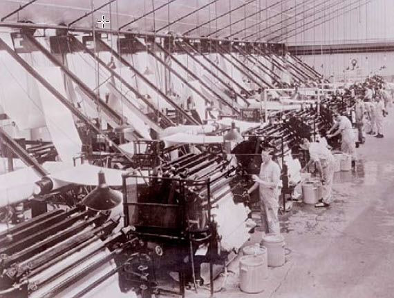
After coating, papers could be calendered between rollers. The glossiest papers got the most polishing. Rough and matte papers were handled more gently so their surface wouldn’t be crushed flat.
This is why “baryta” means more than “slightly glossy.” The classic look came from the base, the pigment layer, the surface finishing, the emulsion, and the processing all working together. Modern baryta-style inkjet papers don’t copy that silver-gelatin construction, but they aim for the same look: a substantial base, a refined coated surface, deep blacks, crisp detail, and the sheen people associate with a good darkroom print.
Texture Was Made, Not Just Named
Kodak’s range went well beyond smooth and rough. Funderburk covers tweed, tapestry, fine-grained, silk, and suede surfaces, plus earlier names like enameled, velvet, linen, parchment, medium rough, and old master.
They were made in different ways.
Some textures started while the paper was still wet, pressed in by marking felts in the press section. Others came from textured press rolls, light calendering, how much baryta was applied, or embossing after coating. Silk, for example, had a regular, recognizable pattern, not the random unevenness of an ordinary rough sheet.
Choosing a surface was part of interpreting the photograph. A smooth, glossy paper showed off fine detail and maximum density. A textured portrait surface could soften detail, break up reflections, and give an image a more tactile, painterly feel. Heavy textures weren’t defects. Photographers chose them on purpose.
The same holds for inkjet. The surface changes how an image reads, even with the same file, printer, and inks. A reflective surface tends to boost apparent sharpness, contrast, and saturation. A lower-sheen or textured surface spreads out reflections and gives the image a quieter feel. Texture can suit portraits, landscapes, black-and-white work, or reproductions of traditional artwork, but it can also fight with very fine detail.
So, the best paper isn’t automatically the one with the most gloss, the deepest black, or the most texture. It’s the one that suits what the photographer is going for.
Sheen and Tint Were Relative Judgments
Funderburk adds another caution: Kodak’s categories were often visual comparisons, not exact numerical standards.
Sheen ran from glossy through high luster, luster, semi-matte, and matte. But two papers both called “luster” didn’t necessarily reflect the same amount of light. The term placed a surface relative to the other papers Kodak sold at the time.
Tint worked the same way. Kodak used names like snow white, white, natural white, warm white, cream white, old ivory, ivory, buff, and a pearly white called pensé. Two papers in the same category didn’t necessarily measure the same color.
Dyes could go into the raw base, the baryta layer, or both. Later papers might also contain optical brightening agents (OBAs), which absorb ultraviolet light and give some of it back as visible blue light. Kodak’s use of brighteners varied by era, by product, and even by what customers in different regions preferred.
That’s why paper white still matters so much in inkjet printing. The bare sheet is the brightest tone the print can show. A cool, bright base can make colors and highlights pop, while a natural or warm base gives black-and-white and quieter images a softer character.
It’s also a reason to be careful when talking about optical brighteners. Whether a paper has them doesn’t, by itself, tell you how long a print will last. Longevity depends on the whole paper and ink combination, how well they work together, display lighting, air quality, storage, and handling. “Archival” should describe tested performance under realistic conditions, not stand in for actually understanding the materials.
A Guide, and a Warning Against False Precision
The last chapter asks whether surface differences can be seen and measured, and whether they really matter. Funderburk doesn’t give a simple answer.
Today’s instruments measure gloss, color, thickness, and surface texture far more precisely than Kodak ever could. Those numbers are valuable, but they don’t erase the history. A double weight sheet from one decade may not match one from another. Two surfaces with the same sheen name may measure differently. And age changes both tint and appearance.
At the same time, the major textures were easy to recognize. Photographers didn’t need a microscope to tell tweed from silk or smooth from rough. The differences mattered because they changed how the finished print looked and what it was for.
That may be the book’s most lasting lesson. Paper specs are important, but they aren’t the print. Numbers help predict how a paper will behave. Only the finished print shows how surface, sheen, tint, ink, lighting, and the image itself come together.
Funderburk’s book works because it brings back the craft behind photographic paper. It records not just what Kodak called its surfaces, but how generations of papermakers and coaters made them. For anyone printing on inkjet today, that history points to a better way to choose paper: understand how it’s built, keep texture and sheen separate, pay attention to paper tint, and judge the print in the light it will actually be seen in.
The technology has changed, but the job hasn’t. A photo paper still has to do two things at once: hold the image accurately, and give it a physical presence you can see and feel.
Download the full book here (via The Light Farm)
Original Publication Date: September 25, 2026
Article Last updated: September 27, 2026
Related Posts and Information
Categories
About Photographers
Announcements
Back to Basics
Books and Videos
Cards and Calendars
Commentary
Contests
Displaying Images
Editing for Print
Events
Favorite Photo Locations
Featured Software
Free Stuff
Handy Hardware
How-To-Do-It
Imaging
Inks and Papers
Marketing Images
Monitors
Odds and Ends
Photo Gear and Services
Photo History
Photography
Printer Reviews
Printing
Printing Project Ideas
Red River Paper
Red River Paper Pro
RRP Products
Scanners and Scanning
Success on Paper
Techniques
Techniques
Tips and Tricks
Webinars
Words from the Web
Workshops and Exhibits
all
Archives
August, 2026
July, 2026
June, 2026
May, 2026
April, 2026
March, 2026
February, 2026
January, 2026
November, 2025
more archive dates
archive article list


Red River Paper Inc. All contents © 1997 - 2026. 8900 Ambassador Row, Dallas Texas, 75247. Prices, specifications, and images are subject to change without notice. Not responsible for typographical or illustrative errors. Website Terms & Conditions | Acceptable Use
Site Development & Maintenance: Phosphor Media, LLC