Success on Paper: Meet Photographer Jonathan Grado
How does this Brooklyn photographer turn the surreal into cinematic fine art?
GALLERY-READY PRINTS MADE WITH RED RIVER PAPER.
Born Into Making
Jonathan Grado grew up surrounded by creation. His mother and grandfather were both painters, and his family's business, Grado Labs, has been handcrafting headphones for decades. During Sunday dinners at the home of his grandparents, whose walls were covered in art, something was quietly taking root. Then his parents gave him a yellow Minolta, and suddenly he found his own way to create.
Surreal by Design
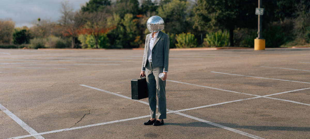
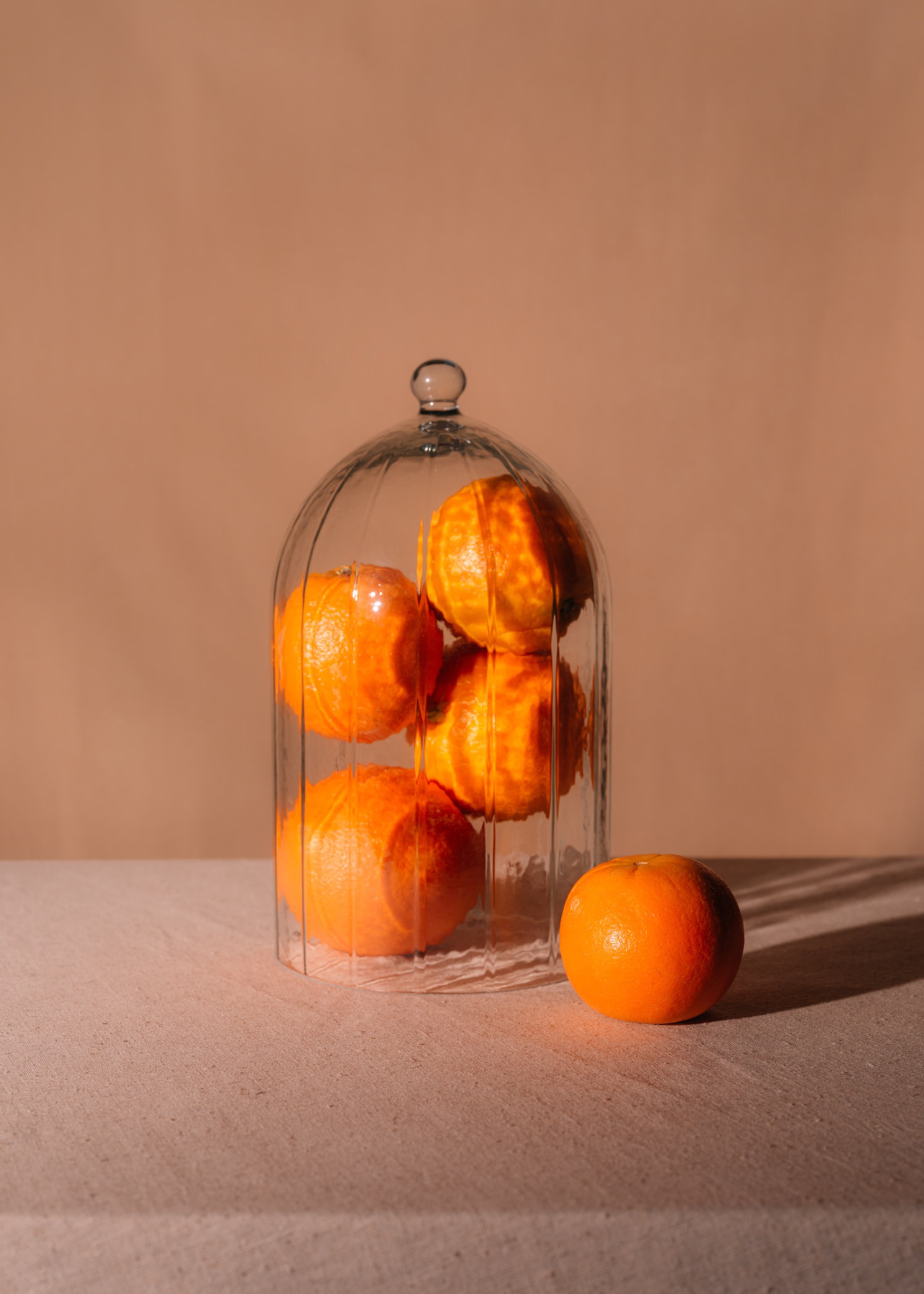
Today, Jonathan's studio practice is defined by a refusal to show things plainly. Working across portraiture, still life, and narrative concepts, he builds images that feel lived-in yet otherworldly: cinematic scenes shaped by melancholy, anticipation, and a sense of the absurd. His projects have included donning a friend’s head with a disco ball, filling a front yard with thousands of plastic balls, and levitating citrus across meticulously constructed sets. "I'm fascinated by surrealism," Jonathan says, "proof that symbolic stand-ins carry their own emotional weight."
Enter Red River Paper
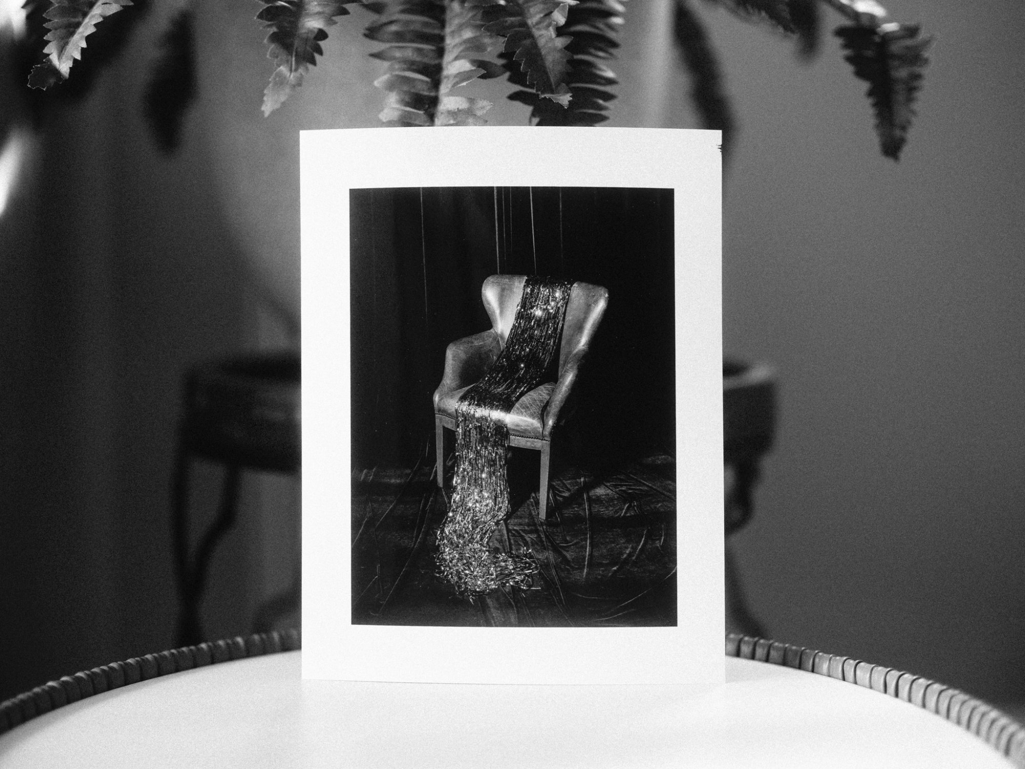
For Jonathan, the physical print is where the work fully arrives. While experimenting with his ongoing "Misprint" series, he worked through most of Red River Paper’s base and fine art sample packs, printing identical images across papers to see the differences. He notes that simple elements like the texture and finish of a print can nudge a photo from literal to emotional.
The result of his test drives? Palo Duro Softgloss Rag has become a go-to. Made from 100% cotton rag with a lightly textured semigloss surface, it sits in that rare middle ground between matte and luster — exactly how Jonathan describes it. The paper's barrier coat locks ink into the soft gloss layer, producing the deep blacks and smooth tonal gradations that make his shadow-heavy, cinematic images sing. The result is a print that looks gallery-ready straight out of the printer, with the feel of a traditional darkroom photograph and the performance of modern inkjet technology.
Then there is the Polar Luster Metallic, which stopped Jonathan cold. Its pearlescent base stock gives prints a luminescent quality. Highlights seem to glow, and colors take on a depth and intensity that shift depending on the light. Jonathan admits he burns the most calories with this one, moving it from room to room just to watch how the light catches it. That responsive, almost living quality is precisely what the Polar Luster Metallic is engineered to do, and for a photographer chasing the space between the real and the felt, it is easy to see why it became an instant favorite.
See More of Jonathan’s Work
Jonathan's work has been honored by SXSW Satellite Art, Black Box Gallery, LensCulture, and F-Stop Magazine. Explore his full portfolio at jgrado.com. Read our full Q&A below for more on his "Misprints" work, a rundown of all four of his favorite Red River Paper products, and his appreciation for “the communal experience of making something together.”
Enjoy our Q&A with Jonathan Grado
What year was your business founded and how did you get started?
I've been around the craft of making my entire life. My grandfather was a painter, and my mother as well. My family's business is building headphones. I grew up watching people assemble beautiful pieces. At Sunday dinners at my grandparents' house, I'd stare at hundreds of paintings, and even though I was not studying them and just looking for a place to hide during games of hide and seek, it was an early exposure to composition.
My first camera was my parents' yellow Minolta, given to me at the age of 5. So, I can say I have been shooting since then. Although around 2009, my uncle gifted me Lightroom, and that was the start of me pursuing photography more seriously.
Tell us a little about what product or service your business offers.
I certainly cannot paint, so photography became my creative outlet. I started with product photography for Grado Labs, shooting headphones and phono cartridges. Over time, I went from just taking photos to building out my studio, wanting my series to communicate themes and narratives.
What makes your business unique?
I love to show stories through sets and characters, never relying on the literal. My work constructs surreal, cinematic narratives shaped by melancholy and anticipation.
I'm fascinated by surrealism, proof that symbolic stand-ins carry their own emotional weight. With my photos, I try to facilitate a space that feels lived in, and at the same time, otherworldly. My goal is to capture an ongoing dialogue with sincerity amidst the absurd.
Where do you source your raw materials from?
The subjects vary, and so the raw materials are different depending on where the idea begins and where it leads me. For portraits, the material is the subject I am shooting, and I like to capture comfort in their space. At other times, I am sourcing fruits for still-life series or building props for narrative-based concepts like my "Happy Hour" series.
Building out the characters and sets is one of the most inspiring parts of the process to me. Simple elements such as the texture and finish of a print can push a photo further from literal and closer to feeling, which is where I want my work to live.
In what ways does the business reflect your own personality?
I’m a perfectionist to a debilitating degree. I stay with my work for a long time before releasing it. This is nothing new in the life of an artist, although humor and empathy for the human experience are embedded deep within me.
In my work, instead of showing literal meaning, I try to reach emotion and narrative through symbolism and motifs. I feel this pushback against fidelity. However, the connection to humor within my personality often gives the completed work an amusing or somewhat daft tone.
Who are your typical customers?
I hope that my photos connect with viewers of all ages. For anyone who has felt the tension and resounding pressure between what others expect and what actually inspires and moves them. I want the work to speak to them.
What is the most interesting project you've encountered in the course of your work?
I don't think I could pick just one. "Happy Hour" was exciting because it meant buying over 4,000 balls to build a ball pit in my friend's front yard, renting a car and filling it to the brim with them, and dressing a friend up in a suit with a disco ball head to act as the character in different locations. I also got to shoot with good friends, which matters to me. I like the communal experience of making something together.
"Saint Citrus" lets me play with props and symbolism in an almost therapeutic way. Levitating oranges, opening umbrellas indoors, and building sets in tight spaces are always fun creative challenges.
What has Red River Paper done for your business? Is there a particular challenge Red River Paper has helped you overcome or a goal they helped you meet?
Yes, particularly with a new series I have been demoing, entitled "Misprints," which is an ever-evolving concept. It is my first project experimenting with printmaking, which involves physically distorting an image by hand, and the paper plays an integral part in the process. No single image comes out the same as the last, so each piece feels unique and out of my control. The series explores how memories change each time you return to them. For the next set of "Misprints," after spending weeks testing several finishes and papers, I worked through most of Red River's base and fine art samples, and there were several options that gave my prints the depth and character I intended when I was shooting the original subjects, that I have not found in other options so far in my practice.
The Polar Luster Metallic, particularly, offered a completely new experience — the feel, the quality — and it was instantly my favorite, inspiring the next stage of the series, "Misprints."
Which Red River Paper products do you use, and what do you appreciate most about them?
I started with all three sampler packs. What I did was choose a range of photos, black and white, deep shadows, brighter shots, and create diptychs and grids. Then I printed the same exact images on each sample paper. That really let me see the differences between them, which were sometimes drastic.
I ended up gravitating toward four papers: Polar Matte 230, Polar Luster Metallic, Palo Duro Softgloss Rag, and Arctic Polar Luster. My two favorites are the Palo Duro Softgloss Rag and the Polar Luster Metallic. I love how the tones come out in the Softgloss Rag and its texture. To me it's almost a hybrid between the matte and the luster. The prints look gallery ready. The Polar Luster Metallic is the one that always makes me burn the most calories, because I'm constantly moving it from room to room to see how the light catches it and how the highlights pop off the paper.
How can people purchase your products/service?
Prints are available via my studio at [email protected]. Other projects and works can be viewed at jgrado.com.
Do you have any future growth plans?
With continuing exhibitions and gallery shows, I want to keep exploring which paper is right for which photos. I recently saw a William Eggleston gallery of his dye-transfer prints, and aside from the photography, I loved the choices of frame, matte, and paper. They all worked together to let the photo speak for itself. So being able to look at a photo and know exactly which paper it needs is a skill I want to keep developing.
Original Publication Date: June 08, 2026
Article Last updated: June 08, 2026
Related Posts and Information
Categories
About Photographers
Announcements
Back to Basics
Books and Videos
Cards and Calendars
Commentary
Contests
Displaying Images
Editing for Print
Events
Favorite Photo Locations
Featured Software
Free Stuff
Handy Hardware
How-To-Do-It
Imaging
Inks and Papers
Marketing Images
Monitors
Odds and Ends
Photo Gear and Services
Photo History
Photography
Printer Reviews
Printing
Printing Project Ideas
Red River Paper
Red River Paper Pro
RRP Products
Scanners and Scanning
Success on Paper
Techniques
Techniques
Tips and Tricks
Webinars
Words from the Web
Workshops and Exhibits
all
Archives
June, 2026
May, 2026
April, 2026
March, 2026
February, 2026
January, 2026
November, 2025
September, 2025
August, 2025
more archive dates
archive article list


Red River Paper Inc. All contents © 1997 - 2026. 8900 Ambassador Row, Dallas Texas, 75247. Prices, specifications, and images are subject to change without notice. Not responsible for typographical or illustrative errors. Website Terms & Conditions | Acceptable Use
Site Development & Maintenance: Phosphor Media, LLC